They say that “information is the new currency”. Although this statement may be a totally overused cliché these days, it does ring true in so many ways. Every organization (from financial institutions and healthcare providers to utilities and manufacturing firms) collects mountains of data daily. Yet, the real challenge isn’t gathering that data. It’s making it meaningful.
When complex analytics or performance metrics need to be communicated to clients, employees, or investors, static spreadsheets and dense PowerPoint charts often fall flat. Data alone rarely inspires action or understanding. This is where animation and corporate video production come into play, transforming abstract numbers into clear, compelling stories that people actually remember.
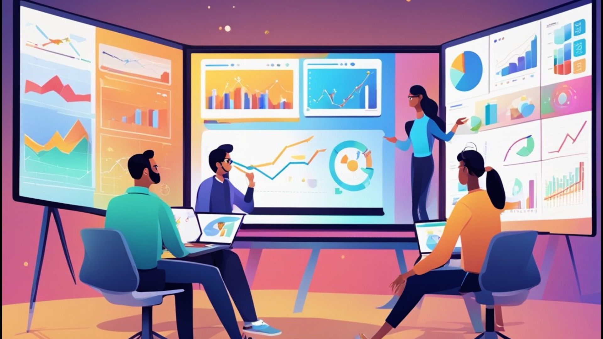
The Corporate Data Challenge
Corporations rely on data for everything: productivity tracking, operational efficiency, customer engagement, financial forecasting, and more. But while numbers might drive decision-making, they’re notoriously difficult to translate into something comprehensive or engaging.
Executives often struggle to present performance reports that hold attention beyond the first few slides. Internal communications teams need to simplify dashboards into something digestible for non-technical staff. Marketers are tasked with demonstrating ROI and impact without losing the audience in jargon.
And in industries like finance, healthcare, and utilities, the stakes are even higher as accuracy and clarity are non-negotiable.
Traditional communication methods like PowerPoint decks, PDFs, or static infographics simply can’t compete with the volume and complexity of modern data. They inform, perhaps, but they rarely engage.
Why Animation Works for Data Visualization
Animation isn’t just for entertainment. When used strategically in the corporate space, it becomes a powerful business communication tool that bridges the gap between data and understanding.
Here’s why animation works so effectively in the corporate world:
1. It Simplifies Complexity
Animated videos can translate abstract or technical data into intuitive motion graphics explaining things in layman’s terms and in a more much more stimulating way. Instead of reading through a dense chart, viewers watch information unfold in a logical sequence. For instance, showing a bar graph grow dynamically or illustrating a workflow through animation allows people to absorb relationships, patterns, and outcomes almost instantly.
2. It Adds Emotional and Visual Context
Numbers by themselves are neutral. But when data is presented within a story enhanced by design, movement, and narration, it creates emotional context. Animation can use colour, motion, and sound to emphasize growth, success, or transformation, reinforcing the message beyond raw statistics.
3. It Holds Attention
In a corporate setting, attention spans are shrinking. Animated content naturally stands out. The movement and imagery keeps viewers engaged far longer than static visuals. It’s no surprise that video content, especially animated video, consistently outperforms text-based or image-based formats across internal training, marketing, and investor communications.
4. It’s Brand-Consistent
Through animation, organizations can maintain consistent branding (tone, colours, fonts, and style) across all presentations and reports. A custom animated video feels professional, polished, and on-brand, reflecting your organization’s attention to detail and innovation.
5. It’s Universal
Unlike complex dashboards that require specialized understanding, animated videos speak a universal visual language. This makes them especially effective for large corporations operating across Canada and internationally or to those communicating to mixed audiences with varied technical expertise.
Turning Analytics Into Narrative
The key to engaging data storytelling through animation lies in narrative design — building a storyline that connects facts, figures, and outcomes in a cohesive, human way.
Here’s how a strong corporate animation project approaches that transformation:
1. Start With the “Why”
Before visualizing any numbers, it’s crucial to define the purpose. What story is the data trying to tell? Are you showing improvement, identifying opportunity, or justifying a strategic shift? Animation should always begin with a clear communication objective.
2. Identify the Key Message
Executives and analysts often want to include everything, but the best data-driven animations prioritize one clear takeaway. What should the audience remember after watching? Animation allows you to guide viewers toward that core insight through pacing, focus, and motion cues.
3. Build a Visual Language for Data
Motion design teams create unique visual metaphors to represent complex concepts. For example:
•Healthcare analytics might be represented through lifelines, patient journeys, or connected networks.
•Financial data might use flowing lines, rising bars, or animated dashboards.
•Utilities could visualize systems through moving energy grids or evolving infrastructure.
4. Use Transitions to Connect Concepts
One of animation’s greatest strengths is seamless transitions. Instead of cutting from one static chart to another, animation moves fluidly between data points, helping viewers understand cause and effect. The result feels more like a story unfolding than a presentation being read.
5. Pair With Voice and Sound
Narration and audio cues reinforce comprehension. A professional voiceover can guide the audience through the story, while sound design highlights critical data moments (for instance – a subtle sound effect being heard when a milestone is reached, or a shift in background music to underscore success.
Industry Examples: Animation in Action
Let’s look at how different sectors across Ontario and the Greater Toronto Area are using animation to transform how they communicate data.
Finance and Banking:
Financial organizations rely on transparency and clarity. Animated videos help illustrate market trends, investment performance, or client reporting in a format that’s visually intuitive. A dynamic animated sequence showing portfolio diversification or quarterly growth can replace dozens of PowerPoint slides while keeping viewers focused.
Healthcare:
In healthcare, data is both vital and complex. Animated explainer videos help communicate research outcomes, patient statistics, or procedural improvements clearly. For internal teams, animated dashboards can visualize hospital performance, resource allocation, or patient flow without exposing sensitive data directly.
Utilities and Energy:
Utility companies often face the challenge of communicating infrastructure updates, sustainability metrics, and energy efficiency results. Through animation, these topics can be turned into visually rich narratives that show progress over time and impact on communities… which is perfect for CSR reporting or stakeholder updates.
Manufacturing and Logistics:
For industrial companies, animation can make supply chain analytics, production efficiency, or output metrics visually compelling. 3D or motion graphic animation can demonstrate how small improvements in process lead to measurable performance gains, making data both tangible and memorable.
The Psychology of Animated Data Storytelling
Animation works not only because it’s visually appealing, but because it aligns with how humans naturally process information.
1. Our brains are wired for motion.Movement draws attention…an evolutionary reflex that makes animated data instantly more noticeable.
2. We remember visuals longer than text.Studies show people retain up to 65% of visual information days later compared to just 10–20% of written content.
3. Story creates emotional engagement.When your data is presented as a narrative journey, it connects emotionally… which then boosts retention and understanding.
In essence, animation turns raw information into experience and that’s what audiences remember.
Integrating Animated Data Videos Into Corporate Communication
For organizations across Toronto and throughout Ontario, animated data visualization isn’t just a marketing tool… it’s becoming a core communication strategy.
Here are some high-impact ways to use animation:
1. Investor Reports and Quarterly Reviews
Replace static presentations with animated summaries that bring key financial metrics to life. These videos can highlight performance, market position, and forecasts with motion and clarity… ideal for shareholder meetings or digital reports.
2. Internal Dashboards and KPIs
Convert complex operational metrics into brief animated updates distributed company-wide. Employees better understand targets and progress when data feels dynamic and contextual.
3. Corporate Social Responsibility (CSR) and Sustainability Reporting
Animated storytelling helps showcase environmental initiatives, social outcomes, and long-term impact, allowing companies to visualize change in ways static data cannot.
4. Marketing and PR Campaigns
Turn case studies, client results, or product performance data into shareable animated videos that amplify reach on social media, websites, or trade events.
5. Training and Onboarding
Data visualization isn’t limited to external use. Animated analytics videos help employees understand company performance and strategy in a consistent and engaging way.
The Production Process: From Data to Animation
While every animation company’s process varies, professional video production throughout Ontario follows a similar strategic structure:
1. Discovery and Data GatheringTeams collaborate with clients to identify key metrics, goals, and audiences. This phase ensures accuracy and narrative clarity.
2. Script DevelopmentWriters and designers translate the data into a script that tells a story. The storyboard visually maps each scene, ensuring the flow of information makes sense.
3. Design and Style FramesGraphic designers develop a visual identity consistent with corporate branding, using iconography, typography, and colour palettes that align with existing materials.
4. Animators bring static graphics to life, synchronizing transitions, data movement, and narration into an engaging video.
5. Voiceover, Music, and Sound Designis then added in by the Animators. They layer sound effects, music and professional voiceover narrations adding emotion, pacing and reinforce the message.
6. The final video is then optimized for the intended platform (investor portals, trade show displays and social media marketing.
Why Animation Is a Smart Investment
Some organizations hesitate to explore animation, assuming it’s either too “creative” for corporate use or too costly. But compared to live-action video production which requires travel, talent, equipment and post production time – animation offers flexibility, consistency, and scalability.
Animated assets can be easily updated as data changes, reused across campaigns, or localized for multiple markets… something particularly valuable for Ontario-based companies with regional and global branches.
Moreover, animated data videos deliver measurable results:
• Increased viewer retention and understanding.
• Higher engagement rates on digital platforms.
• Stronger brand perception of your company (as innovative and forward-thinking).
From Numbers to Narrative
Data alone can inform, but it doesn’t inspire. Animation bridges that gap, turning raw analytics into stories that resonate, persuade, and motivate.
Whether it’s a financial institution sharing quarterly results, a healthcare organization reporting outcomes, or a utility communicating progress to stakeholders, animated video brings the human element back into data.
For businesses across Ontario and the Greater Toronto Area, integrating animation into corporate communications isn’t just an aesthetic choice, it’s a strategic advantage.
Because when audiences understand the data, they connect with the story.And when they connect with the story… they act.